wordpress のテンプレに分割
index.php のままでは wordpress にした意味がないので
これを分割し。
header.php
index.php
footer.php
に分割します
まず、最初にバックアップをとります
cp index.php index.html
vim header.php
で
内容を
<!DOCTYPE html>
<html>
<head>
<meta charset="UTF-8" />
<meta name="viewport" content="width=device-width, initial-scale=1" />
<title>jQuery Mobile</title>
<link rel="stylesheet"
href="http://code.jquery.com/mobile/1.4.3/jquery.mobile-1.4.3.min.css" />
<script src="http://code.jquery.com/jquery-1.11.1.min.js"></script>

<script src="http://code.jquery.com/mobile/1.4.3/jquery.mobile-1.4.3.min.js">
</script>
</head>
<body>
<div data-role="page" data-title="jQuery Mobile">
<div data-role="header">
 <h1>jQuery Mobile</h1>
</div>
<div role="main" class="ui-content">
とします
次に footer.php を作成します
vim footer.php
として内容を
</div>
<div data-role="footer">
 Copyright 1998-2015
</div>
</div>
</body>
</html>
とします
そして index.php は
shell[
vim index.php
[/shell]
で内容は
<?get_header(); ?>
本文だよ
<?php get_footer(); ?>
とします
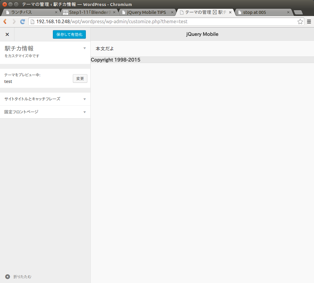
これで
ダッシュボードの外観 で
作成したテーマのライブプレビューで
ページを表示してみると
分割したときと変わらない状態で表示されます

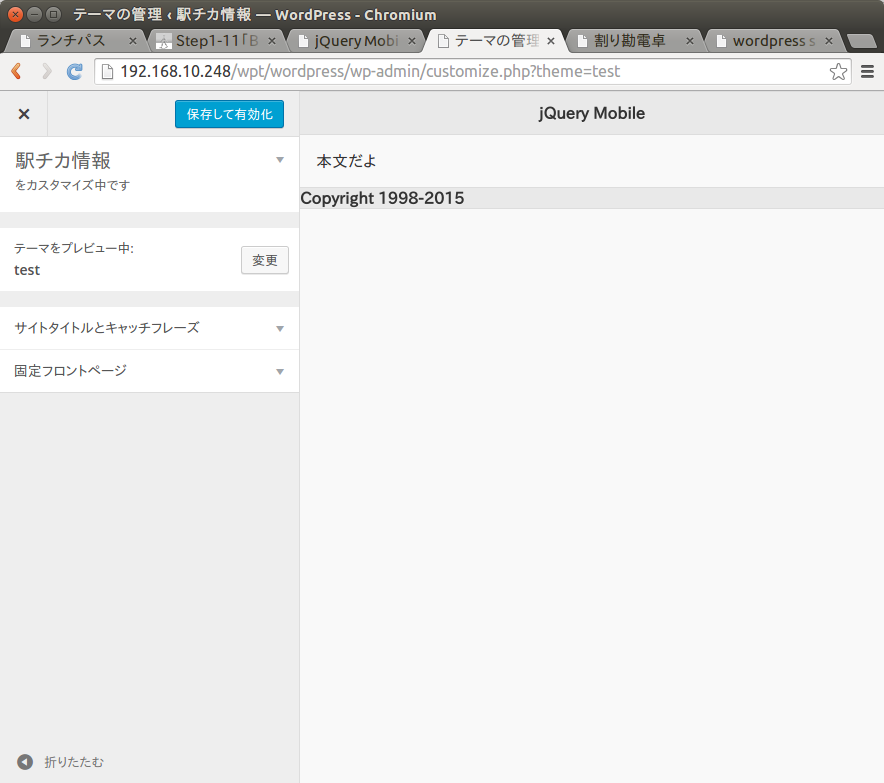
本体そのものは index.php ですが
テンプレートファイルとして
header.php
footer.php
と分割することで
他のページでも使いまわすことができるようになります